As we are doing childrens tv drama we decided the representations of particular social groups should be dominant as this is appropriate for the target audience. We have a young target audience so representations of characters shouldnt be alternative, as they may find this confusing. However the idea for our tv drama is about a boy who is a superhero, but he is not a typical superhero with great powers. He finds it difficult to use them, so this wouldnt be seen as a stereotypical superhero, however he is a sterotypical young boy, the same with our other characters they would all be sterotypical young kids.
Thursday 22 October 2009
Wednesday 21 October 2009
Thursday 15 October 2009
Further Research
Neds Declassified School Survival Guide
This video is inspiration for our own title sequence. We like how it uses a montage of images and the way they introduce the characters using different wipes and cuts.
For our own title sequence we would like to incorporate the way they use still images but with a video clip as well as seen from 15 seconds onwards.
We also like the way they have a speaker telling the narrative over the top of the clips, the idea of giving a back story is something were interested in doing for our own title sequence.
Doing this research into TV drama introductions has influenced our title sequence greatly. We are going to include in ours, a voice over, possibly the main character in our drama speaking about his life. This will give the audience an idea of what the show is about and who characters are. "Ned's declassified" was the inspiration and we thought this effect helped us understand what the show would be about. therefore we hope ours does the same for the audience.
Seeing how Ned's declassified gave a montage of clips to introduce characters gave us an idea to do a similar thing. So far we are thinking, separate clips for each character, and having something that represents them in the background. Ideas so far are colours, pictures, sounds relating to the character for example, dark ominous colours for the villain, and bright, fun colours for the friends/sister which will tell the audience something about them.
Sky High
When researching further into the comic book effect we so want to use in our title sequence we found this video. It incorporates everything we would love to do in our title sequence.
The introduction to it, where its moving through the comic book is something we want to try and do in our title sequence. Obviously we would be limited as we don't have the high tech technology, but the effect it gives has further inspired us to do it as we think it looks amazing.
Wednesday 14 October 2009
Genre and Auteur Theory
Auteurism – the method of analysing films based on this theory or, alternately, the characteristics of a directors work that makes him an Auteur.
My work so far over the course has been quite generic; I’ve not yet developed my own individual style that can be seen throughout my work. I’ve mainly focused on my work relating to generic material than putting my own original spark into it. My magazine was very generic, it conformed to all the typical conventions of a magazine.
My work so far over the course has been quite generic; I’ve not yet developed my own individual style that can be seen throughout my work. I’ve mainly focused on my work relating to generic material than putting my own original spark into it. My magazine was very generic, it conformed to all the typical conventions of a magazine.
Redundancy and Entropy
To me the concept of redundancy is something that is predictable or conventional, something normal that you would expect to see. For example, a policeman stood in full uniform in the street, this is something you would expect to see, therefore highly redundant. A police officer stood in a bikini on the street would not be redundant at all. This would be the opposite which is called entropy.
Entropy is something that is unpredictable. It’s something that you wouldn’t expect to see and that isn’t average. All images arguably have an element of both in them. Entropy and Redundancy can be used to communicate different things to the audience.
Our own ideas have elements of both in it. The mise en scene would be seen as highly redundant; it’s about a school kid doing average things out of school time. This would be seen as highly redundant. Yet we have entropic elements in it, as he is a superhero and would be doing things that are not predictable. I think we have the balance right between entropy and redundancy in our show; it’s redundant enough for our target audience to understand, but the elements of entropy are also understandable as superheroes are becoming more common, so if he could teleport, or run really fast, this would be seen as very entropic, but the audience could understand that this is a redundant thing for a superhero genre.
Our title sequence would be seen as quite redundant as it has typical elements of an introduction.
Thursday 8 October 2009
Research
Childrens TV Dramas
Looking at examples of TV dramas, we've came to understand that they are all quite similar. They use bright colours, fast cuts and interesting layouts to keep the audiences' attention.
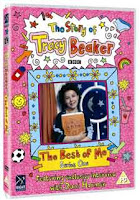
Tracey Beaker is a good example of this.
The title sequence allows the audience to identify the genre of the text and creates appropriate audience expectations, you can clearly see this through the mise-en-scene, and the way the introduce characters and settings, you know its going to be about young kids, and it shows cartoon versions of them being in a house. This sets the scene of what the drama is about. It represents the social group of children as fun and enjoying life, we can see this through the way they act in the titles. By using stop motion on the characters it creates an impression of them moving, this also involves "props" like mobiles and stereos which have been made digitally. Children can relate to this as it may be things that they like doing, for instance listening to music and talking to friends on their mobile. They are represented as typical kids, this is how they engage their audience by making it seem like every day life.
Title sequences are also there to engage the audience and persuade them to keep watching, maybe provide some sort of narrative exposition, 'brand' the show, using music, fonts and images and credit the main actors and other production personnel. Tracey Beaker has made a clear brand for itself using the same fonts and music, their audience are now aware that if they see the fonts and little cartoon images, which are illustrated by Nick Sharrat, its going to be Tracey Beaker as they've also carried this through onto their magazines and DVD covers.
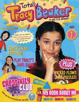
Tracy Beaker has been made for the BBC, this is their mission statement : 'To enrich people's lives with programmes and services that inform, educate and entertain.'
Tracey Beaker therefore has to inform, educate and entertain...they do this by setting it in a children's home, this challenges a dominant ideology of children being with their own family. This then gives across the messages and values that everybody is different, and that children should understand this and learn that although backgrounds may be different, children are still children. This cant really be shown through a title sequence, however it still gives of the representations of typical young children, playing games and having fun.
ICarly
Icarly is and American childrens TV drama, therefore it's likely to be different to English TV dramas.
The title sequence for ICarly attracts its target audience by using characters that are of similar age, this will help audience relate to the show and become more interested. Also the use of transitions like the wipe and cuts make it very fast paced and interesting to watch.
Right from the start of the title you are aware its going to be about a website, as you see it being typed in on a web page, this creates appropriate audience expectations and persuades audience to keep watching.
This also repres
Looking at examples of TV dramas, we've came to understand that they are all quite similar. They use bright colours, fast cuts and interesting layouts to keep the audiences' attention.
Tracey Beaker is a good example of this.
The title sequence allows the audience to identify the genre of the text and creates appropriate audience expectations, you can clearly see this through the mise-en-scene, and the way the introduce characters and settings, you know its going to be about young kids, and it shows cartoon versions of them being in a house. This sets the scene of what the drama is about. It represents the social group of children as fun and enjoying life, we can see this through the way they act in the titles. By using stop motion on the characters it creates an impression of them moving, this also involves "props" like mobiles and stereos which have been made digitally. Children can relate to this as it may be things that they like doing, for instance listening to music and talking to friends on their mobile. They are represented as typical kids, this is how they engage their audience by making it seem like every day life.
Title sequences are also there to engage the audience and persuade them to keep watching, maybe provide some sort of narrative exposition, 'brand' the show, using music, fonts and images and credit the main actors and other production personnel. Tracey Beaker has made a clear brand for itself using the same fonts and music, their audience are now aware that if they see the fonts and little cartoon images, which are illustrated by Nick Sharrat, its going to be Tracey Beaker as they've also carried this through onto their magazines and DVD covers.


Tracy Beaker has been made for the BBC, this is their mission statement : 'To enrich people's lives with programmes and services that inform, educate and entertain.'
Tracey Beaker therefore has to inform, educate and entertain...they do this by setting it in a children's home, this challenges a dominant ideology of children being with their own family. This then gives across the messages and values that everybody is different, and that children should understand this and learn that although backgrounds may be different, children are still children. This cant really be shown through a title sequence, however it still gives of the representations of typical young children, playing games and having fun.
ICarly
Icarly is and American childrens TV drama, therefore it's likely to be different to English TV dramas.
The title sequence for ICarly attracts its target audience by using characters that are of similar age, this will help audience relate to the show and become more interested. Also the use of transitions like the wipe and cuts make it very fast paced and interesting to watch.
Right from the start of the title you are aware its going to be about a website, as you see it being typed in on a web page, this creates appropriate audience expectations and persuades audience to keep watching.
This also repres
Tests
We wanted to test out moving an object across the screen, in this case we used a piece of paper. We did this as an idea for our own title sequence was to put the actors names on small bits of paper and have them moving across the screen.
We got this inspiration from Mortified and Neds Declassified.

This was a test we did to see how well we could convert images into looking like comic books. We think this was really succesful, and learnt how to do it over the internet so it has increased our photoshop knowledge. We feel confident that this is something we'd like to incorporate into our title sequence and use with quite a few images.
We got this inspiration from Mortified and Neds Declassified.
This was a test we did to see how well we could convert images into looking like comic books. We think this was really succesful, and learnt how to do it over the internet so it has increased our photoshop knowledge. We feel confident that this is something we'd like to incorporate into our title sequence and use with quite a few images.
Treatment
Working Title --- Super Dooper
Concept
Troublesome teen who gains super powers but finds it difficult to use them, are his powers more trouble than they are worth?
Purpose
What you can do if you put your mind to it
Desired Outcome
Recognisable to the audience, easy to turn on and watch even for those who have never seen it before. Each episode different and fun but with familiar faces and themes which are easy for the audience to relate with.
We want to introuduce only a couple of characters in the title sequence - just the main characters - The "superhero", "villain" and "best friend or sister"
Audience
‘9 – 14’ as main target audience. This relates to Superhero themed films that are around right now, which are 12a certificate.
Overall style and ‘look’?
The look would fit the theme of comics and cartoons, maybe add an element of child like sketches into it.
Were interested in the look of a flip book aswell, so may attempt to incorporate this into our
What sort of texts are you influenced by?
Mortified because the dynamics of the title sequence – fast cuts and fun animation
Neds declassified – again due to the fast cuts and childlike captions and narrative exposition
What sort of texts might you want to be different to?
We wish to be different from every opening and drama we have looked at, this is because we feel establishing our own identity for the show is imporatant and for this to be done, a different approach in terms of theme, style and characters to other shows will be done to achieve this.
What sort of technology do you think will be involved?
Mini DV Camera
Editing Software – Photoshop & Adobe Premier Pro
What sort of personnel will be involved?
Georgina – Camerawork, Acting and editing.
Dan - Camerawork, Acting and editing.
Actor 1 – Acting
Dates and provisional schedule
9-26th October- Research and planning
26th-23rd November – filming
27th-11th January – post production
Likely problems
Casting
Editing problems
Special effects
Possible Costs
Petrol money - To get to different destinations for filming
Transport issues
Ginas car – Petrol money + Driving ability
Health and Safety Issues
Ginas driving…
May also need permission from parents if we use a young actor
Subscribe to:
Posts (Atom)