Getting feedback from our audience may prove difficult for as it is aimed at 9-14 year olds. Feedback we have retrieved so far has been from 17-18 year olds, the majority of comments were all good feedback, here are a few:
"comic effects were really well executed and it looked very professional"
"clear target audience, definitely suits the audience with the comic book style and genre"
"good use of colour throughout, primary colours are attractive to the younger audience"
"oppositional binary between main characters & bad guy is really understandable through mise-en-scene e.g. colourful for good guy and dark mise-en-scene for bad"
The feedback we received shows that we have successfully targeted an audience of 9-14year olds as this was guessed by people watching it.
The only criticisms of our work were:
"I think the bits where he was dancing, the music needs to be louder so that it looks and sounds like hes dancing to music"
"some clips come on and then change too fast"
These are all things that could be changed if we had more time to perfect it properly. I think we did misjudge the sound levels on different parts of the video
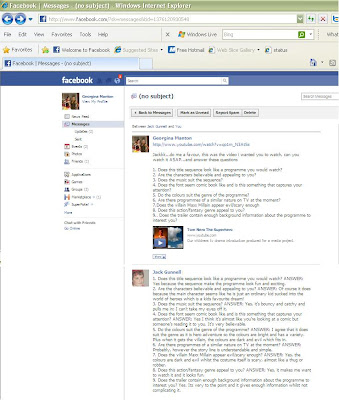
To get relevant consumer feedback I emailed my cousin over facebook and asked my 13 year old cousin 9 questions relating to my title sequence...here is his feedback...

Transcript:
1.Does this title sequence look like a programme you would watch?:ANSWER: Yes because the sequence makes the programme look fun and exciting
2.Are the characters believable and appealing to you? ANSWER: of course it does because the main character seems like he is just an ordinary kid sucked into the world of heroes which is a kids favourite dream!
3.Does the music suit the sequence? ANSWER: Yes, its bouncy and catchy and pulls me in; I cant take my eyes off it!
4.Does the font seem comic book like and is this something that captures your attention? ANSWER: Yes I think its almost like you're looking at a comic but someones reading it to you. Its very believable.
5.Do the colours suit the genre of the programme? ANSWER: I agree that it does suit the genre as it is hero adventure so the colours are bright and has a variety. Plus when it gets the villain, the colours are dark and evil which fits in
6. Are there programmes of a similar nature on TV at the moment? ANSWER: Probably, however the storyline is understandable and simple
7.Does the villain Maxx Millain appear evil/scary enough? ANSWER: Yes the colours are dark and evil whilst the costume itself is scary, almost like a thug or robber
8.Does this action/fantasy genre appeal to you? ANSWER: Yes it makes me want to watch it and it looks fun
9.Does the trailer contain enough background information about the programme to interest you? Yes its very to the point and gives enough information without complicating it
I'm extremely pleased with this feedback, it proves we have successfully targeted our target market. We have been able to pull the audience in and make it interesting. They understand the conflicting ideas of the hero and villain and have also gathered this through the colour schemes we have used.


 In the evaluation stage of my coursework, I used facebook to get myself some feedback on my Children's TV Title sequence. It allowed me to interact with an audience and get their responses, this qualitative data has allowed me to assess whether the video appeals to the correct target market.


