Wednesday 3 February 2010

Question 4 - How did you use media technologies in the construction and research, planning and evaluation stages?

Research and Planning


Before beginning our Research we had to create a treatment and pitch of our ideas, we used Microsoft PowerPoint to make a PowerPoint presentation which we presented to the class.


In the Research and Planning stage, we did a lot of Internet research. We used the website www.blogger.com to record our coursework. As I had used this during my AS level Media I was familiar with how everything works and found it quicker and easier to use this time round.


Google was the main search engine we used to do our research, we used this to find images and information about children's TV drama, we also used YouTube to acquire clips and embed them into our blog.


When doing research we found a website - http://www.photoshoproadmap.com/ which gave us ideas for comic book themes, and taught us how to make a comic book effect pictures using photo shop.


Construction
We used many media technologies during the construction stage of our coursework. Firstly we started to film parts of our title sequence using the Panasonic video cameras, once we had filmed all we needed, we captured the clips onto Premiere Pro 2, this enabled us to start forming our title sequence.


We also used the DSLR cameras to take still images to put into our title sequence, we uploaded them and saved them as a .JPG file to alter later. To adapt the images to look like comic book strips, we opened up the files in Photoshop CS2, we applied different filters and pixelated it to construct a comic book effect.


When using Premiere Pro 2, we cut all the clips and adjusted them on the timeline, we added different keyframeabble effects so other clips/images could fly into one slide etc. As we also wanted a narrative, we decided to make a Voice over using the technology in the music department we recorded Dans voice and added it to the clips, along with background music.


Evaluation

In the evaluation stage of my coursework, I used facebook to get myself some feedback on my Children's TV Title sequence. It allowed me to interact with an audience and get their responses, this qualitative data has allowed me to assess whether the video appeals to the correct target market.


I also used Microsoft PowerPoint to create a presentation for one of the questions, demonstrating my computer skills.


Question 3 - What have you learned from your audience feedback?

Getting feedback from our audience may prove difficult for as it is aimed at 9-14 year olds. Feedback we have retrieved so far has been from 17-18 year olds, the majority of comments were all good feedback, here are a few:

"comic effects were really well executed and it looked very professional"

"clear target audience, definitely suits the audience with the comic book style and genre"
"good use of colour throughout, primary colours are attractive to the younger audience"
"oppositional binary between main characters & bad guy is really understandable through mise-en-scene e.g. colourful for good guy and dark mise-en-scene for bad"

The feedback we received shows that we have successfully targeted an audience of 9-14year olds as this was guessed by people watching it.


The only criticisms of our work were:


"I think the bits where he was dancing, the music needs to be louder so that it looks and sounds like hes dancing to music"
"some clips come on and then change too fast"


These are all things that could be changed if we had more time to perfect it properly. I think we did misjudge the sound levels on different parts of the video


To get relevant consumer feedback I emailed my cousin over facebook and asked my 13 year old cousin 9 questions relating to my title sequence...here is his feedback...
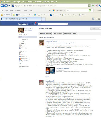


Transcript:

1.Does this title sequence look like a programme you would watch?:ANSWER: Yes because the sequence makes the programme look fun and exciting


2.Are the characters believable and appealing to you? ANSWER: of course it does because the main character seems like he is just an ordinary kid sucked into the world of heroes which is a kids favourite dream!

3.Does the music suit the sequence? ANSWER: Yes, its bouncy and catchy and pulls me in; I cant take my eyes off it!

4.Does the font seem comic book like and is this something that captures your attention? ANSWER: Yes I think its almost like you're looking at a comic but someones reading it to you. Its very believable.

5.Do the colours suit the genre of the programme? ANSWER: I agree that it does suit the genre as it is hero adventure so the colours are bright and has a variety. Plus when it gets the villain, the colours are dark and evil which fits in

6. Are there programmes of a similar nature on TV at the moment? ANSWER: Probably, however the storyline is understandable and simple

7.Does the villain Maxx Millain appear evil/scary enough? ANSWER: Yes the colours are dark and evil whilst the costume itself is scary, almost like a thug or robber

8.Does this action/fantasy genre appeal to you? ANSWER: Yes it makes me want to watch it and it looks fun

9.Does the trailer contain enough background information about the programme to interest you? Yes its very to the point and gives enough information without complicating it


I'm extremely pleased with this feedback, it proves we have successfully targeted our target market. We have been able to pull the audience in and make it interesting. They understand the conflicting ideas of the hero and villain and have also gathered this through the colour schemes we have used.

Question 2 - How effective is the combination of your main product and ancillary texts?

For the ancillary tasks I wanted to stay as redundant as possible. As the audience are 9-14 I needed them to understand the texts, and relate with them.


To recognise the texts I decided to use the same colour scheme and fonts, giving it a "house style" Using red, blue and yellow the audience may recognise this on a shelf and relate it to the show. I also used the main character 'Tom Nero' on the front of both of the ancillary tasks so if the audience didn't already recognise it from the colour scheme and fonts they would recognise the main character.


I didn't want the DVD cover to be the exact same as the magazine style wise...I wanted to incorporate the Tom Nero font though so that it was recognised. I decided to use the background off one of the clips in the title sequence where he says "by night I'm Tom Nero, the superhero" and the background changes to stars. We thought this was quite a 'comicy' look, so I thought it would be appropriate to base the DVD design around that.

Even for children who may have never seen the show, I wanted to make it look interesting and stand out, I made the outside of the characters glow so it looks like they stand out from the cover. You can clearly see its about a normal boy who's a superhero that's why I put them back to back.

I think it relates to the show and is an effective DVD cover which looks professional and attracts the right target audience

For the magazine I kept with the 'house style'. After doing research into children's magazines I decided to keep it childlike and makes sure I gave freebies and 'insider knowledge' to attract toe audience.

The combination of all these texts definitely shows a 'house style' It uses the same fonts, colours, pictures and comic styles. I think this was definitely necessary for our young target audience. Looking at the Title sequence, magazine and DVD I think that they all relate nicely to eachother and you can clearly see the link. I think our target audience will appreciate the DVD being slightly different as its exciting and a change, but as it is still the same font and 'Tom Nero' logo its still recognisable.


Question 1 – In what ways does your media product use, develop or challenge forms and conventions of real media products?